 Ross Mackintosh's debut graphic novel Seeds is a wrenching, first-person account of Mackintosh's father's last months as he died of lung cancer. It's not exactly upbeat, but it's also not merely an existential misery -- rather, it's a moving tour of Mackintosh's emotional journey as his father slipped away, filled with regret and love, sorrow and humor, exasperation and sweetness. I ended up crying in a restaurant as I finished it, but I spent the rest of the day turning it over and feeling good for it. Mackintosh's father -- a no-nonsense engineer who was gruff but loving -- went well, as these things go, and Mackintosh's experience of his father's cancer brought him to terms with all sorts of father-son stuff that many of us think about. I recommend it without reservation, but bring a box of tissues with me when you're reading it.
 Thursday, February 24, 2011
Seeds: comic-book memoir of father's cancer is moving, sweet
 Ross Mackintosh's debut graphic novel Seeds is a wrenching, first-person account of Mackintosh's father's last months as he died of lung cancer. It's not exactly upbeat, but it's also not merely an existential misery -- rather, it's a moving tour of Mackintosh's emotional journey as his father slipped away, filled with regret and love, sorrow and humor, exasperation and sweetness. I ended up crying in a restaurant as I finished it, but I spent the rest of the day turning it over and feeling good for it. Mackintosh's father -- a no-nonsense engineer who was gruff but loving -- went well, as these things go, and Mackintosh's experience of his father's cancer brought him to terms with all sorts of father-son stuff that many of us think about. I recommend it without reservation, but bring a box of tissues with me when you're reading it.
 10 Architecturally Wondrous Staircases
![credit: www.guysports.com[http://www.guy-sports.com/funny/amazing_staircases.htm]](http://s3.amazonaws.com/curbly_uploads_production/photos/0000/0012/9884/image032a.jpg)
A friend forwarded me one of those emails her husband got at work. It was full of photos of amazing staircases plus some strange magic eye type puzzles. Being the visual person that I am, I became completely fixated on the staircases and even went so far as to search for more and more visually indulging photos of creative staircases. I couldn't get enough. Who thinks of these designs? ![credit: www.blogcatalog.com[http://www.blogcatalog.com/blogs/f-u-r-n-i-t-u-r-e]](http://s3.amazonaws.com/curbly_uploads_production/photos/0000/0012/9900/mytalkings.blogspot.coma.jpg)
![credit: www.flickr.com{http://www.flickr.com/photos/27319692@N03/favorites/page26/?view=md]](http://s3.amazonaws.com/curbly_uploads_production/photos/0000/0012/9904/image031a.jpg)
![credit: www.dizzydee.com[http://dailyartcocktail.com/page/9/]](http://s3.amazonaws.com/curbly_uploads_production/photos/0000/0012/9908/amazing_stairs_06a.jpg)
![credit: www.oddee.com[http://www.oddee.com/item_96882.aspx]](http://s3.amazonaws.com/curbly_uploads_production/photos/0000/0013/0004/a96882_3-sydney.jpg)
![credit: www.shangralafamilyfun.com[http://www.shangralafamilyfun.com/stairs.html]](http://s3.amazonaws.com/curbly_uploads_production/photos/0000/0012/9920/image034a.jpg)
![credit: www.dizzydee.com[http://www.dizzy-dee.com/art/amazing-staircases]](http://s3.amazonaws.com/curbly_uploads_production/photos/0000/0012/9932/image.jpg)


![credit: www.oddee.com[created at: 02/23/2011]](http://s3.amazonaws.com/curbly_uploads_production/photos/0000/0013/0008/a96882_1-loretto.jpg)
Sent from James' iPhone
Visualizing the wealth of America's super-rich ruling class


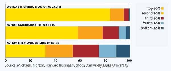
A series of 11 infographics from Mother Jones vividly illustrate the widening gap between America's rich and poor, and how skewed Americans' views of this inequality are. The myth of the American dream has led plenty of ordinary Americans to believe that they are rich-people-in-waiting, leading them to support policies that benefit the rich at their expense (see the chart after the jump for more).
It's the Inequality, Stupid (Thanks, Mmechanic, via Submitterator!)
- Santa Fe Institute economist: one in four Americans is employed to ...
- Much of what investment bankers do is socially worthless - Boing Boing
- UK's super-rich get even richer - Boing Boing
- Florida foreclosure mill owner who chucked out 70000 families in ...
- A pictorial day in the life of a Tijuana millionaire's wife ...
- Winner-Take-All Politics: how America's super-rich got so much ...

Sharing the power in Tahrir Square

How Tahrir Square's protestors shared their power: an exuberant spaghetti, wall-warts, and charging handiphones of all variety.
How Watson Could Have Been Defeated on Jeopardy

IBM's Watson computer beat two human opponents on Jeopardy. Would this strategy have worked?
via Borepatch
17-year-old Tim Burton's rejection from Walt Disney Productions
The manuscript and letters were on display at Kid City's Tim Burton@MOMA exhibit in NYC.February 19, 1976
Dear Tim:
Here are some brief impressions of your book, The Giant Zlig.
STORY: The story is simple enough for a young audience (age 4-6), cute, and shows a grasp of the language much better than I would expect from one of today's high school students, despite occasional lapses in grammar and spelling. It may, however, be too derivative of the Seuss works to be marketable--I just don't know. But I definitely enjoyed reading it.
ART: Considering that you suffer from a lack of the proper tools and materials, the art is very good. The characters are charming and imaginative, and have sufficient variety to sustain interest. Your layout is also good--it shows good variety in point-of-view. Consequently, I not only enjoyed reading about the Giant Zlig, but I got a chuckle watching him, too.
Letters of Note: The Giant Zlig (via IO9)
Sent from James' iPhone